Sterling Woodworks didn’t need “a prettier website.” They needed a site that felt like them – warm, personal, and premium – without drifting into the cold, sterile vibe that a lot of high-end design inspiration tends to create.
This is a simplified, Fix My Website-friendly recap of the project. If you want the full visual breakdown (old vs new, desktop vs mobile, and screenshots), I’ll link the original case study at the end.
The situation
Sterling Woodworks is a high-end cabinetry and woodworking team in Sterling, Illinois. They design, build, and install premium wood interiors. Their marketing advantage is simple: the work is excellent – and the client experience is even better.
About five years ago, I worked with owner Scott Hibbard on a redesign that was solid, professional, and organized. But the vibe leaned “traditional contractor website” – clean and capable, not especially refined, and not built for storytelling.
Then creative director Megan Wheeler stepped in with a clear goal: elevate the brand online and make it feel more in line with premium lifestyle brands (think Studio McGee). Totally fair. My only concern was warmth – many of those reference sites are beautiful, but emotionally cold. Sterling Woodworks isn’t cold. They’re approachable, collaborative, and personal.
So the mission became:
Build a modern, high-end website – but make it feel human.
The quick wins that mattered most
1) Brand-aligned messaging
We rewrote the core narrative to mirror how they actually work. Jargon and “general contractor talk” got cut. Their process became the spine of the copy:
Design. Build. Install.
When messaging mirrors process, prospects relax because they can picture the path. That’s why when I fix websites, the process is:
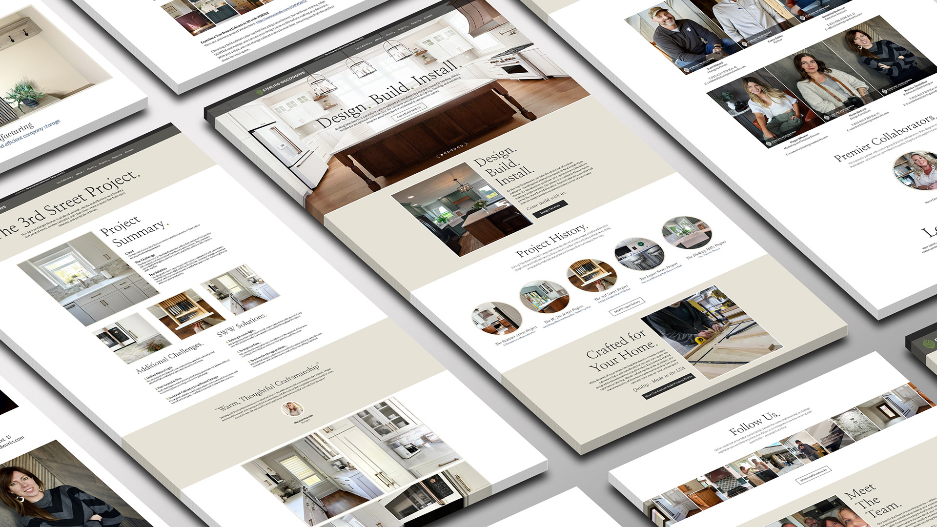
2) A portfolio that sells (not just a gallery)
The old portfolio showed photos. The new portfolio shows proof.
Each project has space to breathe, clearer structure, and room for details that help a homeowner think, “Yep – that’s us.” We also built in social sharing because great work should be easy to pass along.
3) A blog worth reading
Megan wanted to share ideas and inspiration, but most business blogs turn into random “updates.” We introduced The Workbench – a branded blog built around her voice, designed for clean storytelling and future SEO value.
The Workbench also showed me how important a theme and direction, along with a sense of identity could be. This was so much more powerful than “Our Blog” or “Company News” – it became an entity, and this realization is what spawned The Conversion Lab – the blog you are reading right now.
4) Built for growth, not maintenance headaches
Everything is modular by design. Sections can be moved, swapped, duplicated, or repurposed without breaking layout or calling a developer for every small change. That’s the quiet superpower: the site can evolve with the business.

The design direction: premium, but approachable
We aimed for a warmer, high-end direction anchored in earth tones, gentle greens, and a cool blue accent for contrast. Typography followed the same “approachable luxury” rule: refined but readable.
We paired Nanum Myeongjo and Arapey Italic for elegance and personality, with Lato Regular for clarity and flow. The goal wasn’t to look fancy. The goal was to look confident.
The 5-step approach (steal this)
- Clarify the message
Rewrite the core narrative, remove fluff, and say the same thing everywhere. - Rebuild the structure
Use real UX hierarchy. Put the high-impact items where eyes naturally go. Add trust signals on purpose. - Elevate the portfolio
Turn “photos on a page” into a storytelling system. Great work persuades when it’s presented like proof. - Build content that supports the brand
Not “a blog.” A content hub with a voice, designed to educate and connect with ideal clients. - Design for flexibility
Modular sections so the website can grow without needing a rebuild every time the business evolves.
Designed together (the part people skip)
This site didn’t come out of a single “big reveal.” It came out of working sessions, email threads, and feedback loops where we kept tightening the same few things: clarity, warmth, and trust. Megan brought the design sensibility and brand vision. I brought structure, UX strategy, and a relentless focus on stripping away anything that felt generic. That collaboration is why the final site feels intentional instead of templated.
What we delivered
A custom-built, fully responsive platform that reflects Sterling Woodworks’ warmth, craftsmanship, and clarity, including:
- A redesigned homepage with clearer positioning
- Modular service pages
- A storytelling-driven portfolio system with sharing
- A personality-rich team page
- The Workbench blog
- SEO and mobile-first fundamentals
The takeaway
A high-end website isn’t about looking expensive. It’s about removing doubt.
When your site feels clear, intentional, and human, the right people lean in faster – and you spend less time “convincing” and more time booking good-fit projects.


Leave a Reply