
Echelon Front doesn’t mess around with fluff.
So when their team needed launch visuals for a new Extreme Ownership Academy course – The Ladder of Alignment – the goal wasn’t “make something cool.” It was: create a visual system that looks unmistakably Echelon Front, communicates the core metaphor instantly, and drives enrollments without confusion.
This is the Fix My Website version of the case study – focused on the principles and execution. At the end, I’ll link the full original breakdown (with the full visual progression, concept rounds, and final assets).
The situation
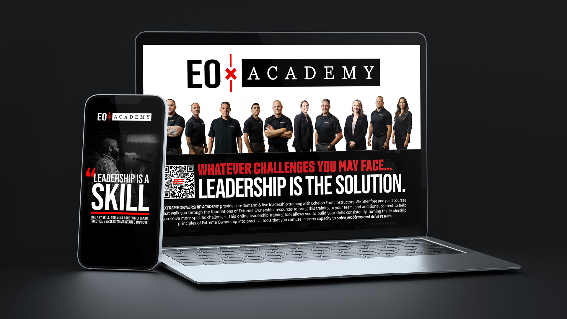
Client: Echelon Front (founded by Jocko Willink and Leif Babin – authors of Extreme Ownership).
Project: Course asset design for the Extreme Ownership Academy.
Objective: Build a visually compelling, high-conversion course identity for The Ladder of Alignment, taught by Jocko Willink + Dave Berke – and create the full set of launch assets that marketing could deploy immediately.
Deliverables included: course thumbnail, landing page, campaign assets, course visuals, email graphics, social posts, and a final course badge + certificate.
Quick wins that mattered
1) One visual system across everything
The biggest “conversion win” wasn’t a single graphic – it was consistency. The course needed one clear identity that would show up everywhere (thumbnail, landing page, email, social) so the audience instantly recognized it.
2) Approved thumbnail that became the anchor
After multiple concept directions and rounds of refinement, the final thumbnail was selected as the official course thumbnail.
3) Multiple departments aligned
This wasn’t “design for marketing only.” The final concept needed to satisfy instructors, marketing, and leadership – all looking at the asset through different lenses.
4) Delivered fast (because EF moves fast)
Echelon Front has an operational tempo. The assets needed to land early, pre-sized, and ready to deploy across platforms to maximize clicks and reduce internal bottlenecks.
Chris Deming (EF’s Communications Manager) summarized the relationship well: unique identity, unique audience, and design that respects both.
These quick wins could also be viewed as a roadmap for success. This wasn’t something we set out to do, but it happens naturally when you follow my 3-step approach.
The design direction: “mission-aligned” visuals
Echelon Front’s mission is battlefield-tested leadership for organizations. That means the visuals must carry authority – not glossy “tech course” vibes.
The final design leaned hard into EF’s language and aesthetic: ladder symbolism, grit & grime texture, bold fonts, and a militaristic visual strategy because it resonates with their audience and reinforces the meaning of alignment and discipline.
The process (steal this)
1) Start with multiple metaphors, not one guess
I presented five thumbnail directions exploring different approaches (upward momentum, clarity, team focus, light vs grit), each explained with symbolism, color logic, and structural notes.
2) Let the client pick favorites, then sharpen
Their early favorites were V1 (ladder realism) and V5 (glow + clarity). That’s useful because it tells you what they’re reacting to: realism + authority, but also clarity + impact.
3) Get one critical insight that changes the whole outcome

Corey Mize gave the best feedback of the project: the ladder should form an A-frame to reflect how alignment narrows as you rise (values, mission) and culminates in a single unified point/target. Dave cared about this too.
That small structural change added meaning (not just style), and we also added more “instructor face” to increase human connection and depth.
(It’s amazing how much a tiny dash of insight can change things. That’s why you should subscribe to The Conversion Lab.)
4) Expect the scope to expand if you deliver trust
After the core concept landed, Chris Deming pulled me into additional email marketing support and expanded campaign assets beyond the initial ask.
One key moment: when an email campaign faced potential spam flagging, I pivoted fast by creating two versions and offering sliced PNG delivery to speed deployment.
5) Build a landing page that mirrors the campaign
The landing page was built for conversion with a clear headline (“Clarity. Alignment. Results.”), a bold CTA above the fold, benefit icons, and cohesive EF/Academy branding.
The visual system stayed locked: A-frame ladder, orange glow, gritty texture – guiding the eye from “CHAOS” to a clean enrollment path, with repeated CTAs and credibility anchors (Jocko + Dave).
What shipped
Final deliverables included: the final video thumbnail, course listing assets, course completion certificate + badge, dual email campaigns (text vs image-based), a social graphics package, and a custom landing page for future promotions.
The takeaway
Most marketing “fails” are alignment failures.
When your visuals, message, and structure aren’t aligned, people hesitate. When they are aligned, the user experience feels inevitable – and the CTA becomes the obvious next step.
Get some.


Leave a Reply